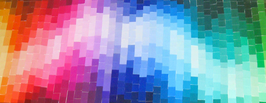
A handcrafted mosaic riddled with imperfections, contrasting the precision of the color matching industry.
There was plenty to organize but very little to purge while settling into my current apartment. So when I came across an unusual picture frame left by previous tenants, I kept this out of the donation pile. A year had gone by until I found some overused Pantone books that were headed for the dump. That just felt wrong. These two pieces of trash eventually crossed paths in my studio and I got to work.
I spent a leisurely 6-months from concept to finish – selecting the proper hues, cutting them from the sheets and then into little squares, sequencing the pattern, pasting the chips down to the base. But I was also intentionally sloppy. I wanted to juxtapose the precision of the color matching industry with the mosaic’s inaccuracies, frayed edges and poorly aligned grid. The project took 20 hours in total.
This piece is featured above the entertainment center. The movement and energy created from the illusion of volume can offer some much needed inspiration to pry yourself away from the television. A number of design friends have geeked over it. It’s bright. It’s trash. It’s treasure.